Technical Diagramming
Affinity Diagrams: Improve Your Team Collaboration

AI Workspace for Diagrams & Collaboration
Get your team started in minutes
Sign up with your work email for seamless collaboration.
Affinity diagrams, also known as affinity mapping, are a powerful tool for organizing and analyzing complex information.
Imagine you've put all your passion into creating a new app. You've worked tirelessly, gathered feedback, and thought you'd nailed it. But, nobody's really using it. You're flooded with feedback, but it's all over the place. Some people love it, others hate it. You're stuck with a mess of conflicting opinions and no clear direction. You’ve lost. What's wrong? Is the app confusing? Too expensive? Missing something? You’re overloaded with info, but can't see the real problems.
Then you discover affinity diagram. Instead of looking at boring spreadsheets, you use digital sticky notes on an online whiteboard. Everyone throws in their thoughts. Then, you start grouping them. "Hard to start" goes with "confusing app." "Too pricey" goes with "not enough features." And "no team stuff" goes together. Suddenly, the mess makes sense. You get to know that the start-up process is confusing, the price is wrong, and they need teamwork features.
The sticky notes help you see the big picture. It's not just a bunch of random feedback anymore. Now, you know what to fix. You can stop guessing and start making real changes to get people using their app. That's how affinity diagram turn a big problem into a clear plan.
This blog provides a complete overview of Affinity Diagram. We will cover everything, from knowing when it helps, to getting set up, and how to build your own. Let's start by defining what an affinity diagram actually is.
Affinity diagrams, also known as affinity maps or affinity charts, are a valuable business analysis technique, designed to organize and understand large volumes of unstructured data. It makes the identification of trends, issues, and potential solutions easy by grouping related ideas or data points.
The process involves collecting input from various sources, such as brainstorming sessions, user interviews, or survey results. These inputs are generally recorded as individual items, often on physical or digital notes. You can also group these items based on their similarities and uncover the common threads and patterns within the data. The affinity diagram definition, in short, is a way to organize large amounts of data.
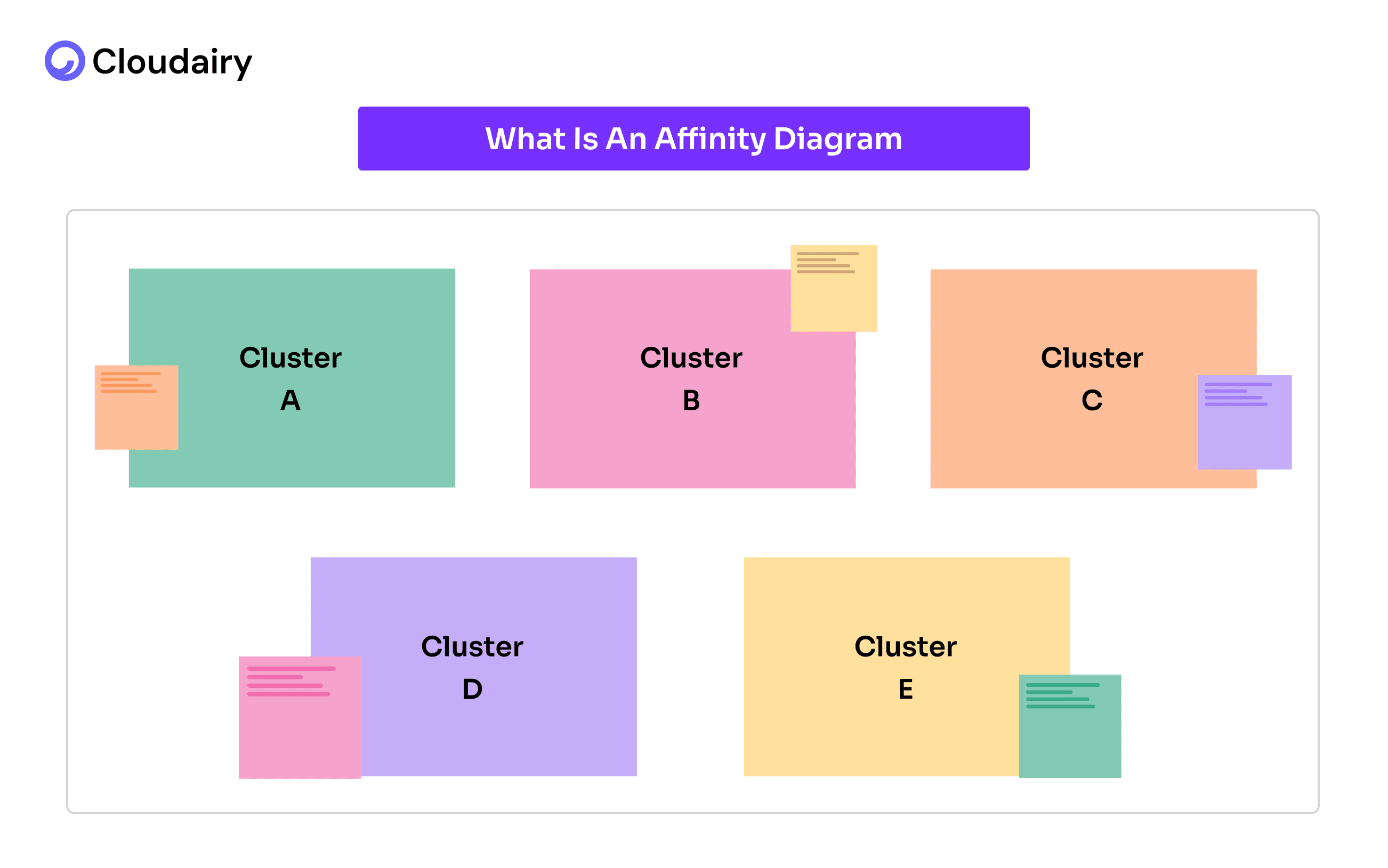
Once you have finished grouping the data, the diagram shows you how different ideas connect, even if they we are related before. Affinity diagrams are not only limited to brainstorming, they help teams understand the situation better and make smarter decisions. Plus, you can also decide what issues need to be addressed first by visualizing the relationships between data points and make the biggest impact.
Let's understand this with a simple breakdown:
Purpose:
Process:
Outcome:
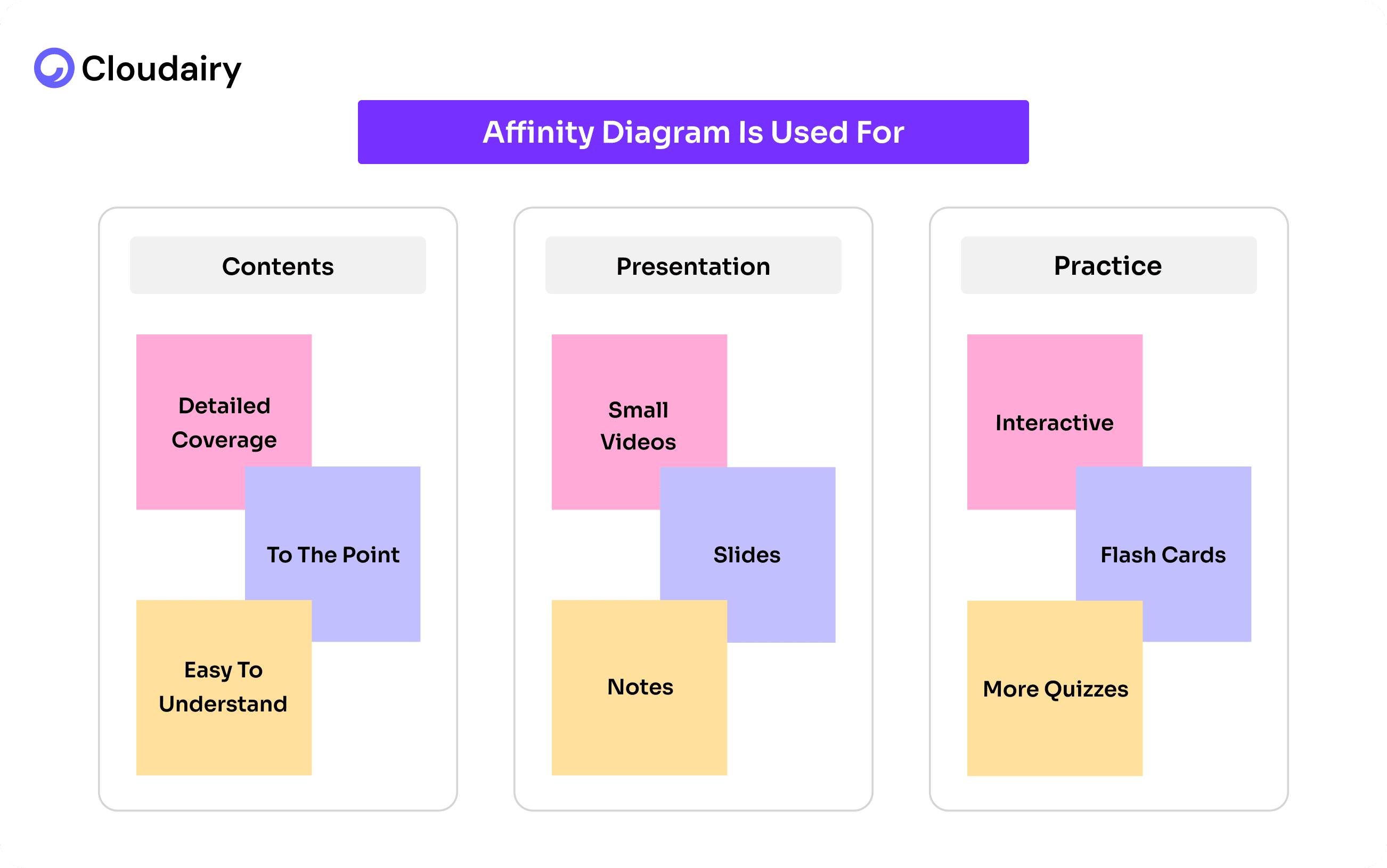
To understand the Affinity Diagrams, there is nothing better than the real-world examples. Let's have a quick look at this simple example.
At a large university, a decline in student satisfaction with its support services was being experienced. Students were complaining about long wait times, confusing processes, and a lack of personalized assistance. The university administration wanted to address these issues but was overwhelmed by the sheer volume of feedback they received from surveys, emails, and student forums.
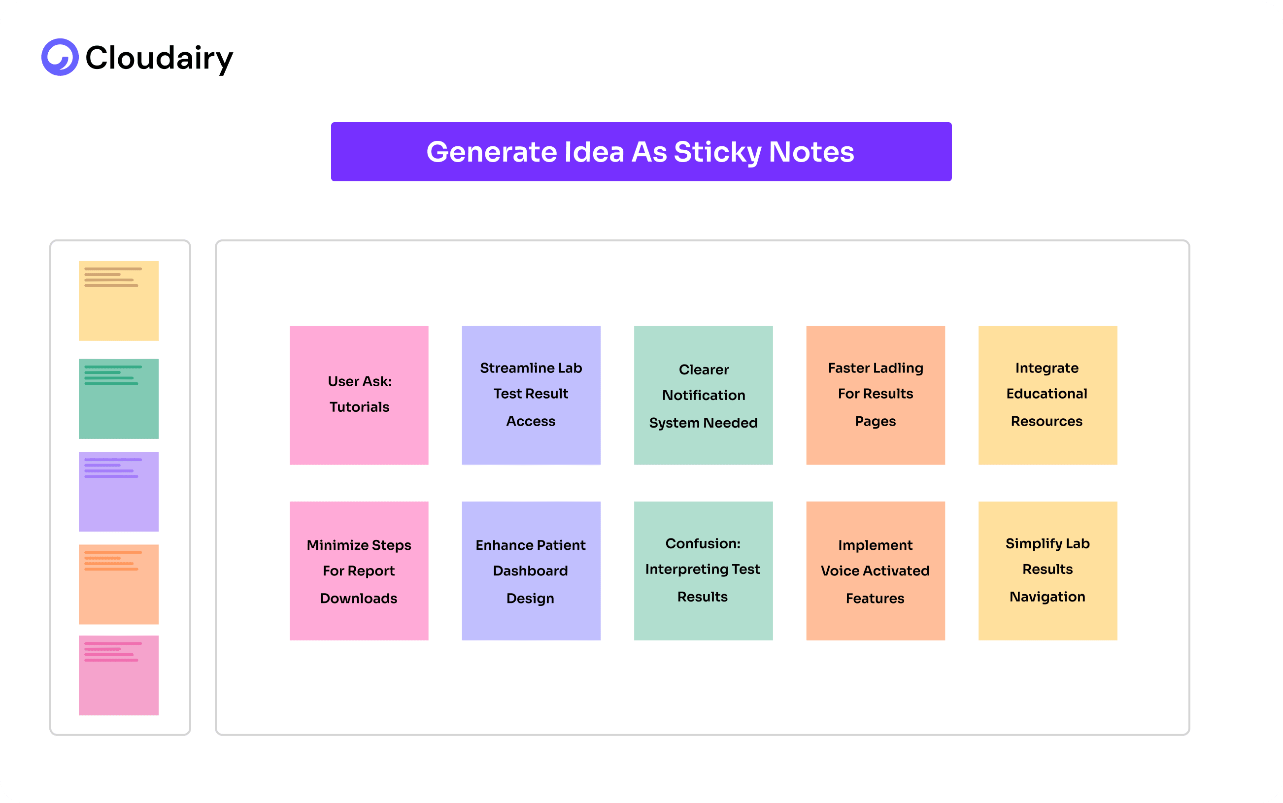
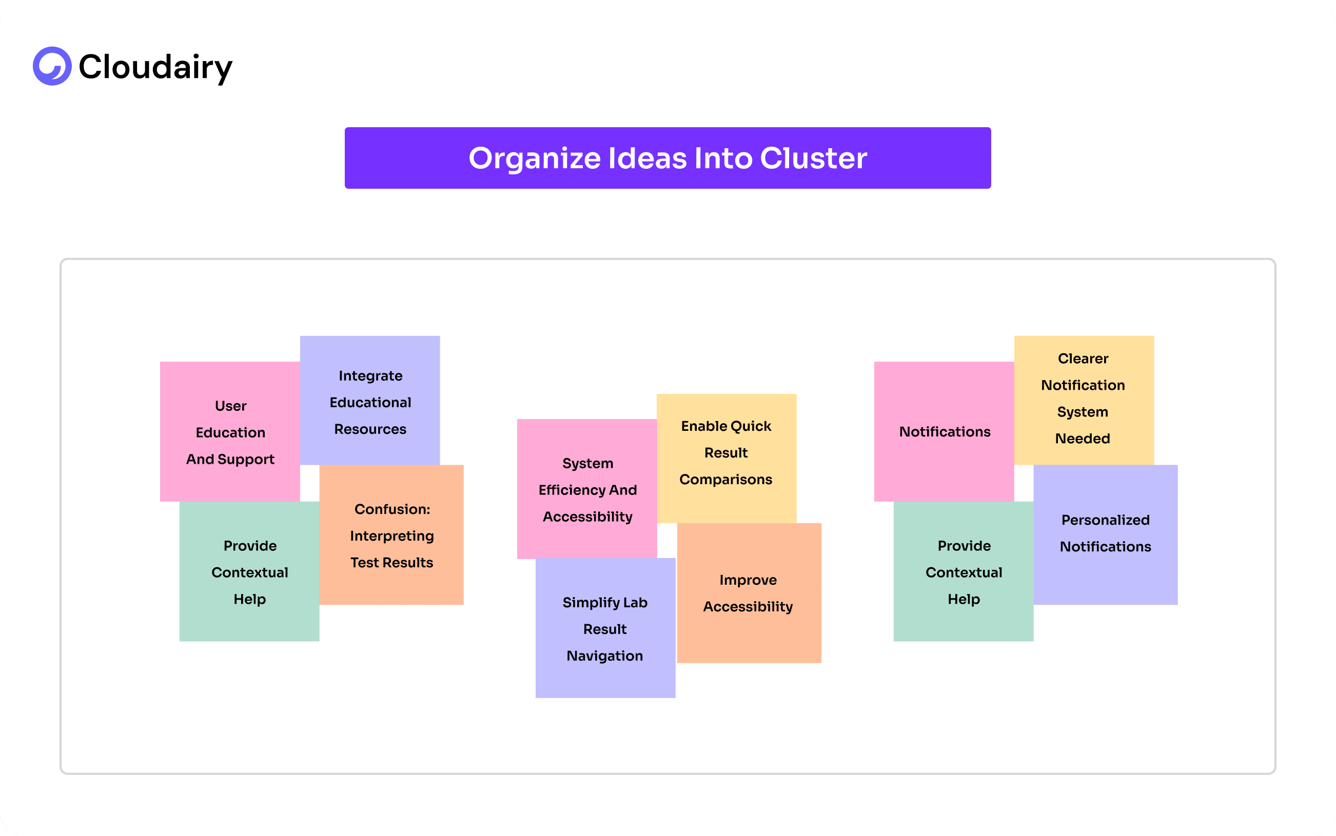
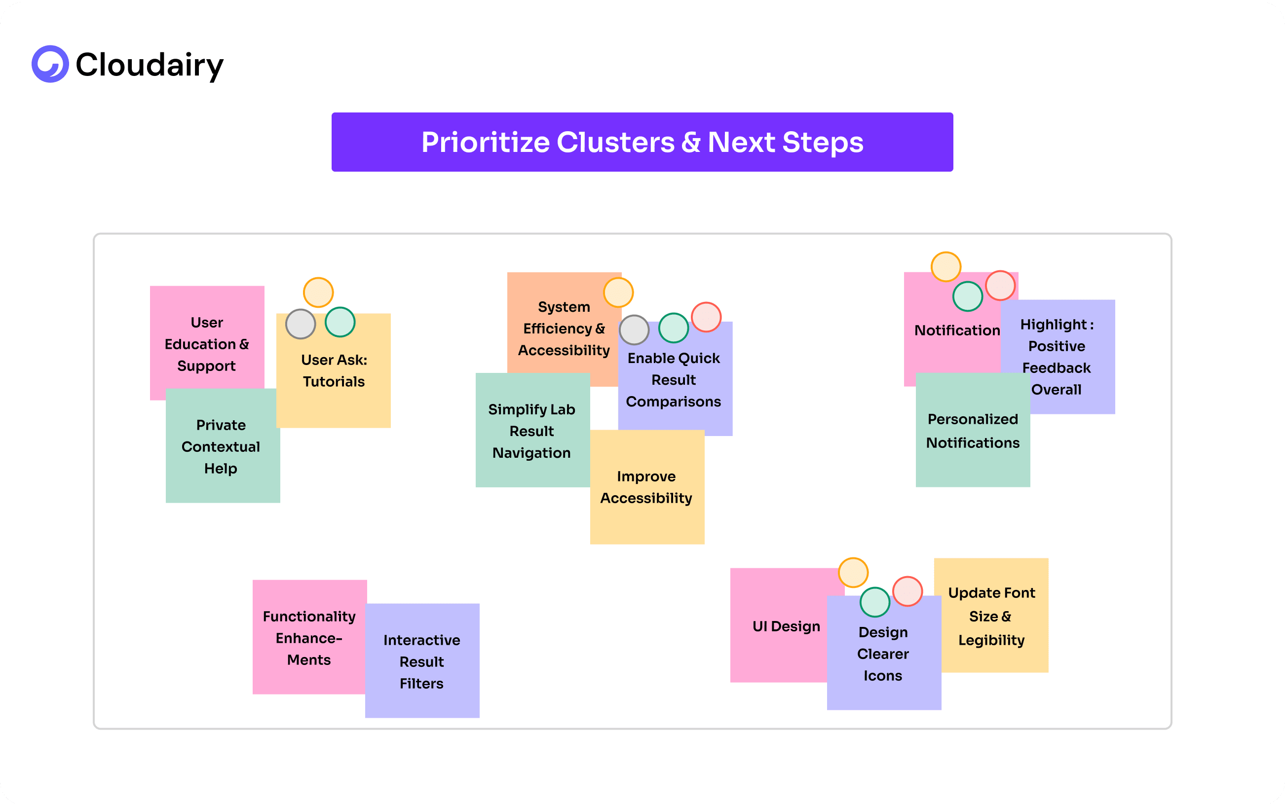
How a software company uses an affinity diagram to organize customer bug reports.
Data Collection:
Affinity Mapping Session:
Identifying Themes:
Actionable Insights:
Result:
The sticky notes showed them what was really bothering students.
They figured out which problems were the biggest and most important.
Then, they came up with ways to fix them, like:
Affinity Diagrams were developed by Jiro Kawakita, who was a Japanese anthropologist. He created the Affinity Diagrams in 1960 and because of him, Affinity Diagrams are sometimes referred to as the KJ method.
Kawatika faced the challenges of organizing unstructured and complex data as the traditional methods were not enough to capture the nuanced relationships within the data.
Consequently, he developed this method to help organizations analyze and arrange complex data sets more intuitively and collaboratively. The affinity diagram is used for many things, but especially for organizing messy data.
Affinity Diagram is one of the seven techniques that are used to drive quality improvement and strategic decision-making within organizations. They were developed and popularized in Japan largely in response to the post-World War II industrial reconstruction, and have since gained global recognition.
Here's a simple breakdown of all seven:
From its creation by Jiro Kawakita to its role as a key management tool, the affinity diagram has a rich history. To fully utilize its potential, understanding when to apply it is crucial.
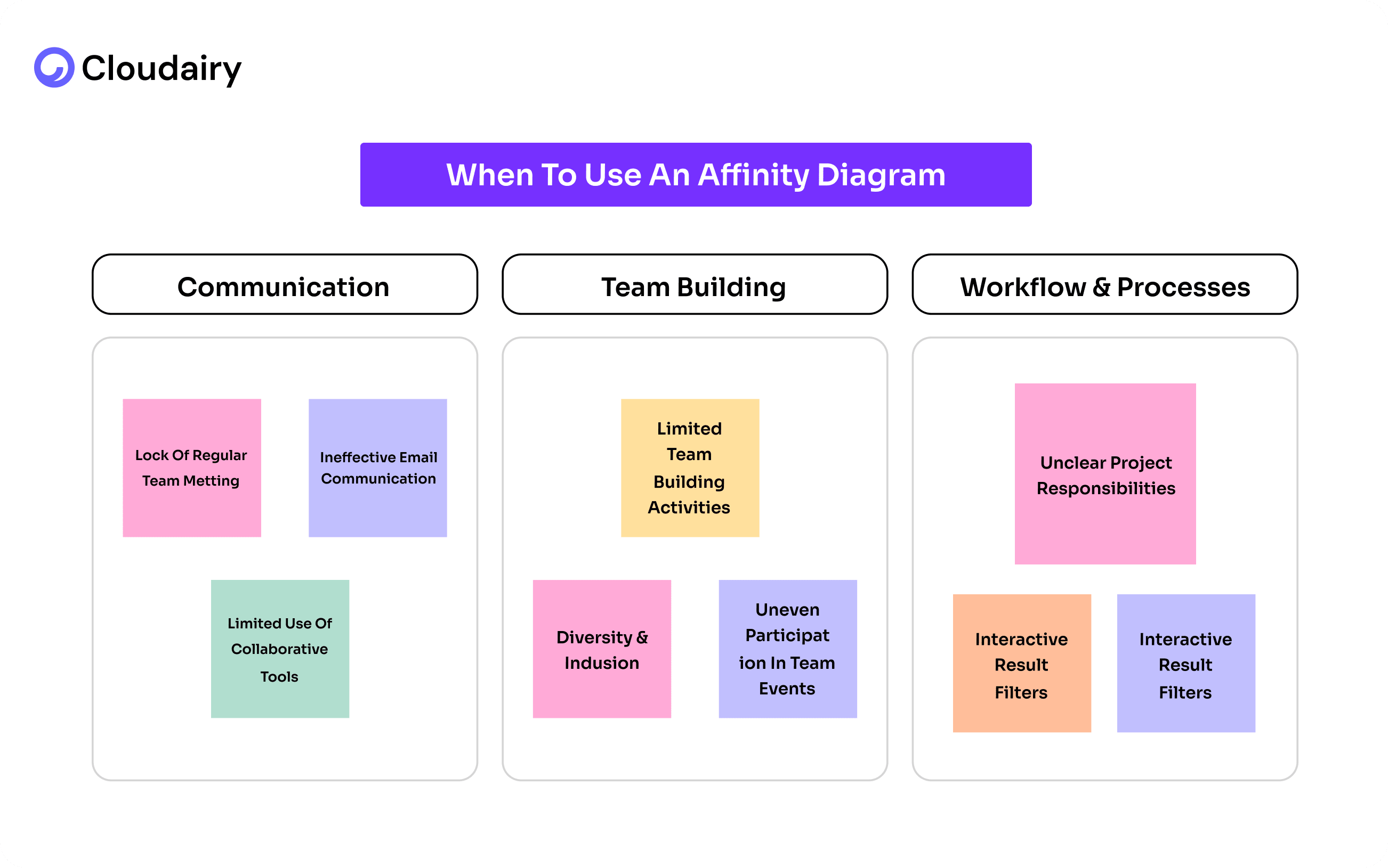
Affinity Diagrams are incredibly useful in various situations, but they truly shine when you face specific challenges usually after a brainstorming session:
After a brainstorming session is over, you have a lot of unorganized data, scattered ideas, chaos and confusion. An Affinity diagram helps you consolidate those ideas into logical groups, making it easier to understand and act on.
Having a large amount of qualitative data such as customer feedback, research notes, or survey responses often makes your data complex, and there is always a lack of clarity amongst teams. When attempting to organize work activity, an affinity diagram can be very useful.
An Affinity Diagram helps you collaboratively identify patterns and relationships that might be hidden within the data, eventually helping you move from abstract ideas to concrete actions.
Recognizing these scenarios allows you to deploy affinity diagrams strategically.
But before diving in, knowing how to prepare adequately is vital for success.
Before you start sticking notes all over the place, let's take a quick look at a few things that'll make your affinity diagram way more useful.
1. Define the Purpose and Scope:
Before getting started with an affinity diagram, it's really important to know what you want to get out of it. First, figure out the main problem you're trying to solve.
What are you hoping to learn? Then, decide how much information you'll be working with and what you'll focus on.
Will you use real sticky notes or a digital whiteboard?
Finally, decide what you want to achieve. Do you want to find ways to improve how people use your product? Or do you want to vote on the most important ideas? Knowing these things will help you have a much better affinity diagram session.
2. Gather the Right Participants:
Start by assembling the right team for a successful Affinity Diagram brainstorming session.
Try inviting a diverse group of stakeholders, ensuring representation from all relevant departments or teams, and including external stakeholders like customers or users whenever possible. You will be needing different kinds of people in a room to get the best ideas and solve the problems as well.
A range of perspectives and expertise is important for better decision making, however, to keep the focus intact, limit the group size to a manageable 5-10 participants.
3. Collect and Prepare the Data:
Gather all relevant data- brainstorming notes, customer feedback, survey results, research findings.
Make sure it's easy to use, like writing it on sticky notes or typing it into a computer.
If you're using real sticky notes, get plenty of them and markers.
If you're using digital tools, make sure everyone can get to it and knows how to use it. This will make your meeting about improving the user experience go smoothly.
4. Choose a Facilitator:
An experienced facilitator is important for a successful Affinity Diagram session.
This individual should be experienced in leading group discussions, maintaining neutrality and guiding the process without bias.
Their primary role is to keep the session focused, effectively manage time constraints, and actively encourage participation from all team members, enabling a collaborative and productive environment.
5. Set Up the Physical or Virtual Workspace:
To have a good affinity diagram meeting, you need the right space. If you're meeting in person, find a big room with a whiteboard or paper. Make sure it's bright and everyone has comfy seats.
If you're meeting online, choose a program that lets you work together and see things visually, like one with Cloudairy’s affinity diagram template and digital sticky notes.
No matter how you meet, test everything first. You don't want technical problems to mess up your meeting.
6. Review Your Notes
After a successful completion of your brainstorming session, a thorough review is essential of the information you’ve just discussed. This helps you get a good grasp of what was discussed and how to group the ideas in the Affinity Diagram.
If you are worried about the time it will take, use Cloudairy. It's an online whiteboard that makes it quick and easy to upload, see, review, and share your notes with your team.
You can also explore our ready to use Template on Cloudairy to create, customize, and visualize your market analysis effortlessly.
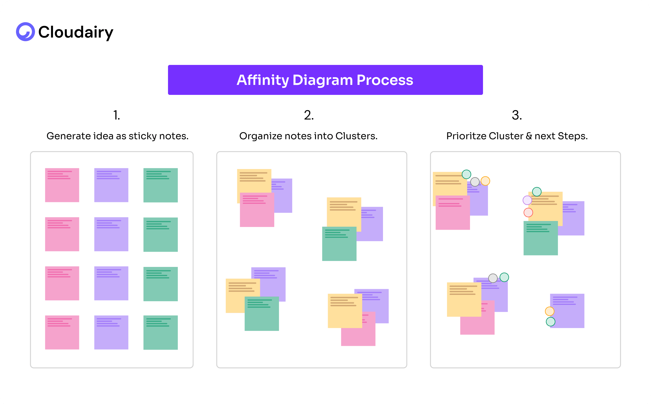
Ready to turn your jumbled ideas into a clear plan? Let's walk through building an affinity diagram in three easy steps, and see how Cloudairy can make it even simpler.
Step 1: Get All Your Ideas Out There (Brainstorming)
First things first, let's get everything out of your head and onto something you can see. Think of it like a brain dump!
If you're using Cloudairy, you can just type your ideas directly onto the digital whiteboard. Or, if you prefer, grab some real sticky notes and write down each thought. The point is, don't hold back. Just write down anything and everything that comes to mind about your topic. When creating an Affinity Diagram, these ideas will give you a lot to work with.
Step 2: Find the Connections (Grouping)
Now for the fun part! Take a look at all those ideas you've got. Start moving them around, looking for things that seem to go together. It's like sorting your clothes – you put shirts with shirts, socks with socks. With Cloudairy, you can drag and drop your digital sticky notes or ideas into groups. Don't be afraid to create lots of groups at first. You might find that some smaller groups fit into bigger ones later. The goal is to see the patterns that are hiding in your ideas. Cloudairy's visual interface makes this process really intuitive.
Step 3: Make Sense of It All (Labeling and Action)
You have your groups – great! Now, give each group a name that explains what it is about. It's like labeling piles of clothes for easy identification. In Cloudairy, you can easily add labels to your groups.
Once everything is labeled, take a step back to see the bigger picture.
This helps you understand what you can do with those ideas. Cloudairy lets you share your diagram with your team, so you can all work together to turn those insights into action.
And Cloudairy can help you go even further:
Using an affinity Diagram Template is much easier with Cloudairy. It lets you unlock the power of organized thinking. Let's walk through the simple steps to effectively use the affinity diagram template within Cloudairy.
Step 1: Write down your ideas directly into Cloudairy and categorize them, let all your team members join in, since it’s a virtual brainstorm, everyone can add their thoughts and ideas, just share the Cloudairy board with them.
Step 2: Now, look at all those ideas and see which ones are similar. Talk about them with your team, either in person or using Cloudairy's video chat or use your preferred video chat. Start connecting the dots! Everyone can add their digital sticky notes to share what they think.
Step 3: Start moving your ideas into groups in the Cloudairy template itself. Keep doing this until all your ideas are organized. Initially, you will find some ideas don’t seem to fit anywhere, but you can come to them later. Cloudairy makes it easy to drag and drop everything.
Step 4: Now take a look at your affinity diagram, make sure everyone agrees with the outcome and its organization.
Use Cloudairy’s Affinity Diagram Template today! After grouping related issues using affinity diagrams, teams can further analyze underlying problems with a fishbone diagram to identify root causes visually.
Businesses nowadays are more customer-centric, almost half of the businesses are paying attention towards top-notch user experience as they are ready to even pay more for a great experience.
The recent research says 86% customers are willing to pay a premium for a positive experience, while 17% will abandon a brand after just a single negative interaction.
If you don’t pay attention towards a seamless user experience, you are more likely to lose your customer.
Affinity mapping UX data is a very effective way to improve user experience. You gain deeper insights by organizing data like customer research and user interviews, eventually making a place for targeted improvement.
The beauty of affinity diagrams lies in their adaptability. The best way to use them depends entirely on the information you have gathered and the grouping logic that resonates most with your team.
Benefits of Using Affinity Diagrams in UX Research:
Imagine trying to cook a big meal with all your ingredients scattered across the kitchen. You'd waste time running back and forth, probably forget something, and end up stressed. Now, picture having everything neatly organized by category spices together, vegetables in one spot, meats in another. Cooking becomes smoother, faster, and more enjoyable.
That's the power of an affinity diagram for your team's ideas. Instead of a chaotic jumble, it creates a clear, organized picture. Like grouping your groceries, it sorts your insights into logical themes. This not only makes complex information easier to digest but also transforms those insights into practical, actionable steps, preventing those "forgot the bread" moments in your projects.
Cloudairy helps you create better affinity diagrams with just a few steps:
First, collect all your information – user feedback, notes, ideas – and write each one on a separate sticky note (or use a digital version). Then, group similar notes together. Look for patterns and themes. Give each group a name.
Next, decide which themes are most important. For each important theme, create a list of specific, doable steps. Assign someone to each step and make a plan with deadlines.
Cloudairy’s affinity diagram template lets everyone work together, even if they're in different places. This process helps turn messy ideas into clear actions.
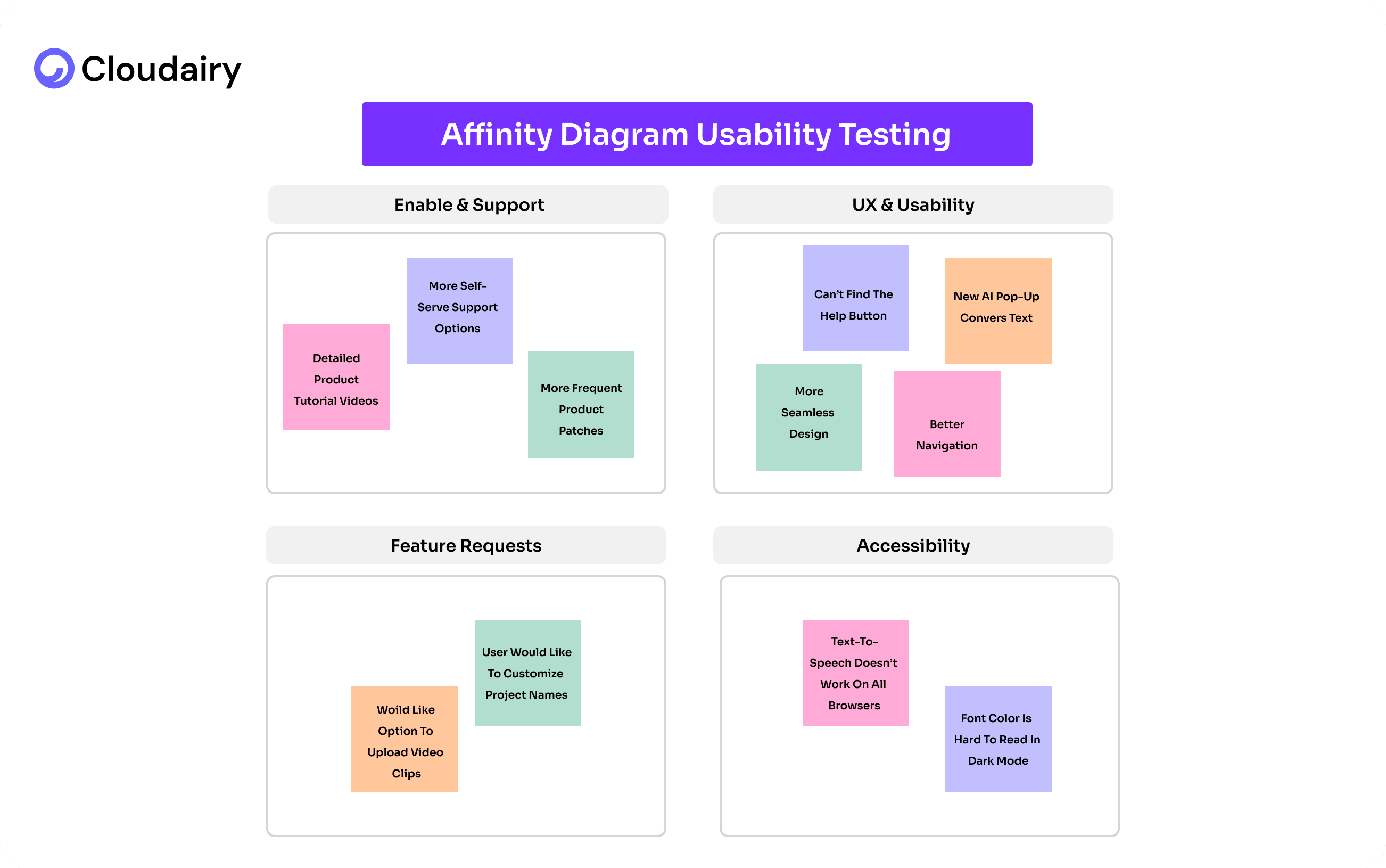
Let's explore some affinity diagram examples to better understand its applications.
Click here to get started with Cloudairy's Affinity Diagram Template!
Start using Cloudairy to design diagrams, documents, and workflows instantly. Harness AI to brainstorm, plan, and build—all in one platform.
Table of Contents

Introduction
 Manage all your work in one placeCollaborate with your teamUse Cloudairy for FREE—forever


 Related Articles
.webp)