WorkHub
- Home
-
Cloudairy Al
- Pricing
- Book a Demo
Whiteboard
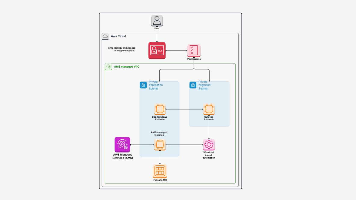
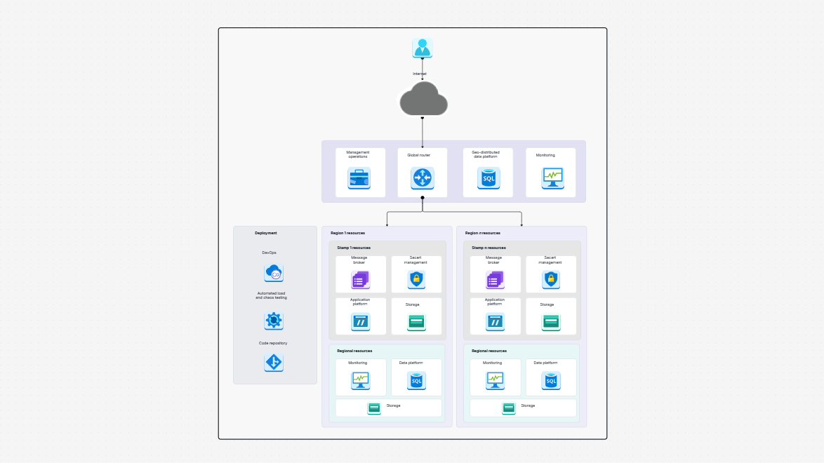
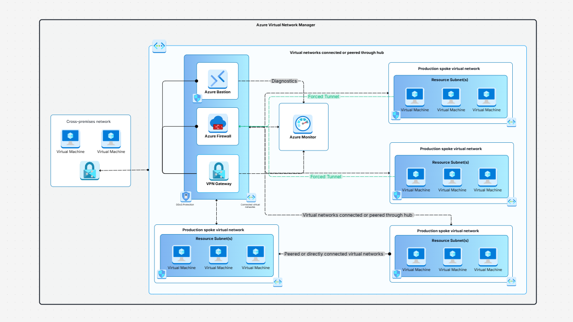
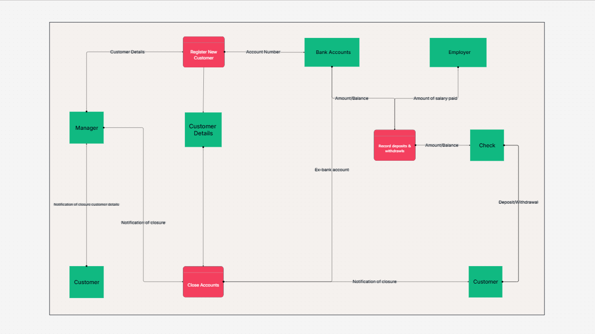
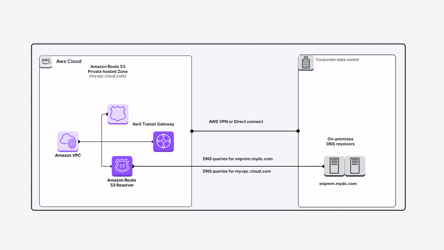
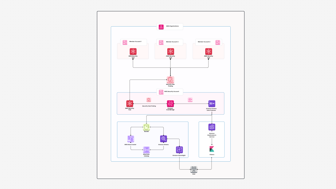
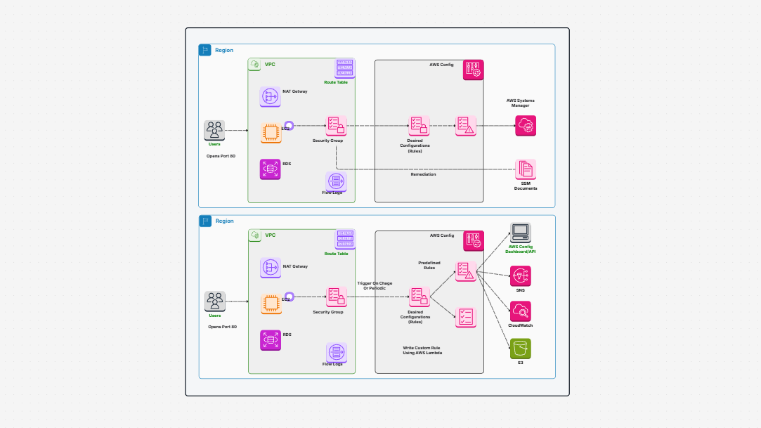
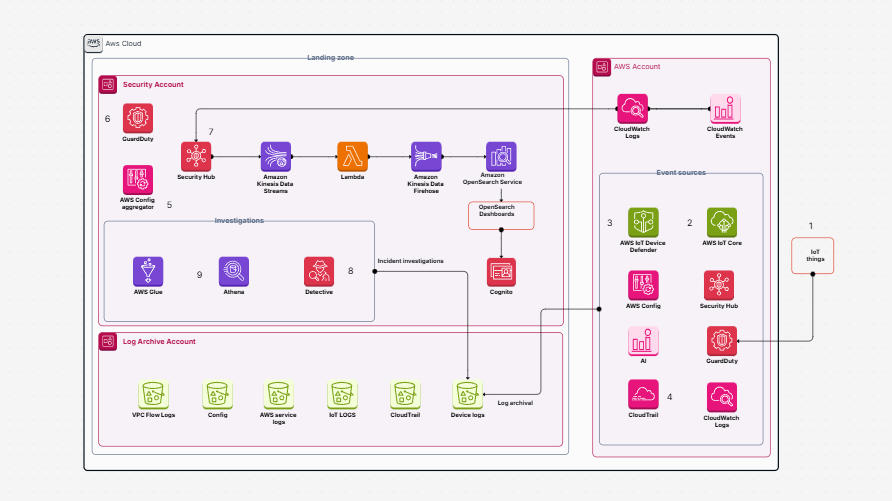
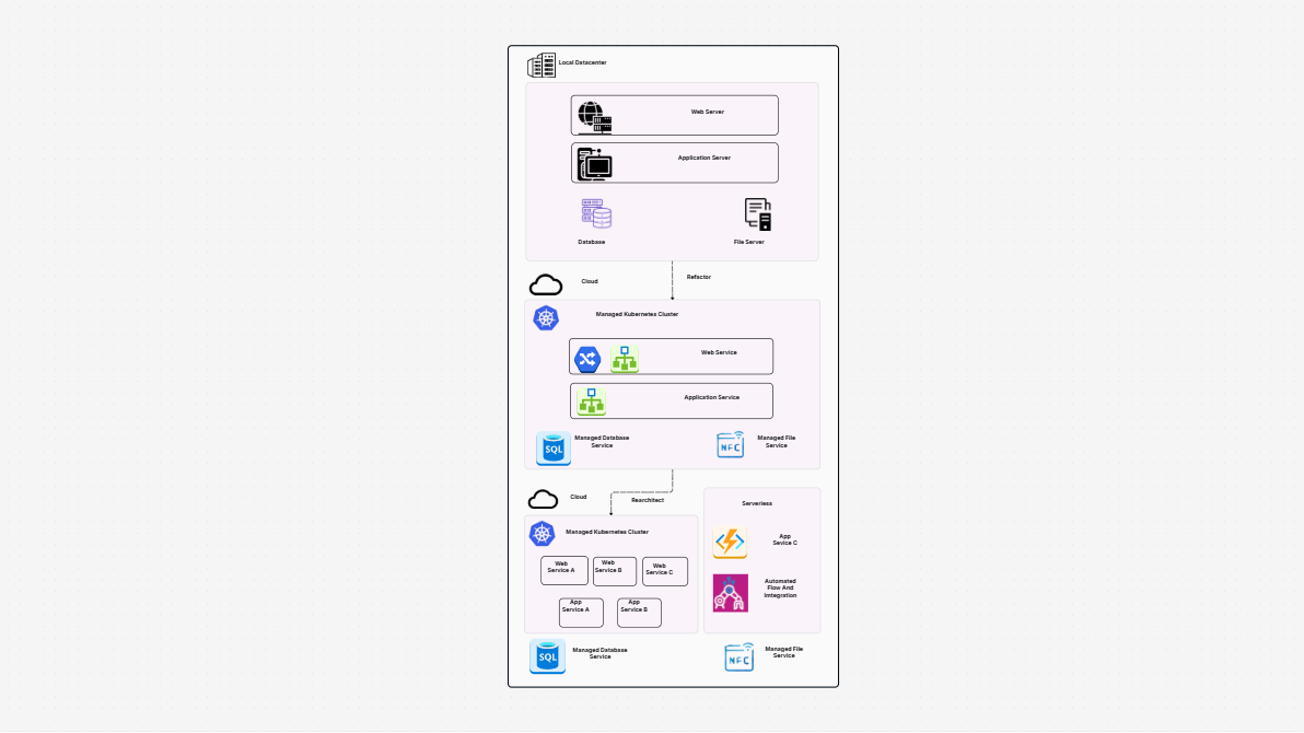
The Physical Data Flow Diagram (PDFD) acts like a map of your data. It shows where your data comes from, such as users or roles. It also shows where the data travels, like processes and storage. Lastly, it explains how the data gets there, including networks, files, and systems. Just clarity, no guesses. It helps teams work together and comprehend dependencies by bridging the gap between abstract data concepts and practical implementation.
This is the real thing, not just a draft. It identifies the files, manual processes, hardware, and software required. It’s great for showing how information flows between users, applications, and databases. This includes customer account actions, transactions, and registration details. It adds useful detail to your diagrams. This is especially helpful in tech-heavy and compliance-focused environments. It also serves as a useful guide when conducting system audits, integrating new engineers, or describing procedures to stakeholders who are not technically inclined.
When:
You record financial or banking systems.
You need easy-to-understand diagrams for regulators. They should also be ready for audits. Training sessions for new IT employees or compliance officers are also sped up with clear visuals.
You want to track how employee or customer data flows.
You might be focused on onboarding, developers, or setting up system architecture. To identify inefficiencies prior to implementation, use it in the early stages of design.
You’re also creating data handling policies or access rules. Making decisions about security procedures and privacy regulations aided by visualizing the flow.
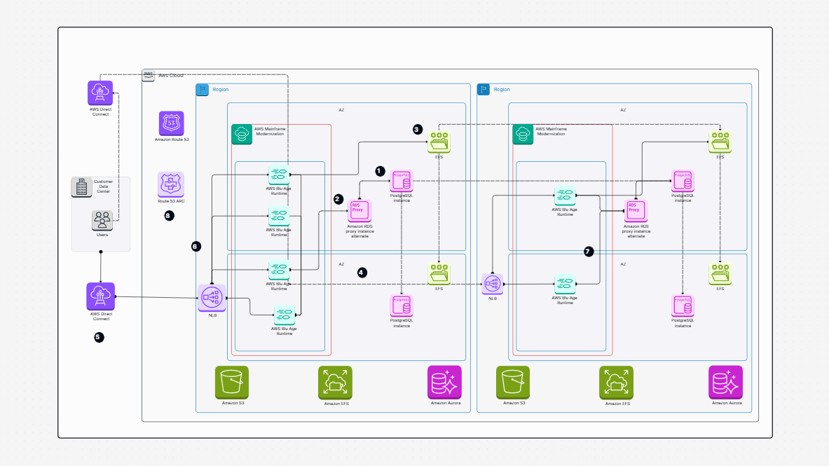
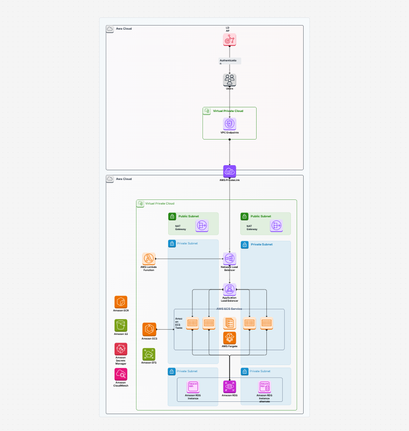
This physical data flow diagram would help a data-driven environment with strict regulations. It's about "what actually happens." This includes file names, print reports, and data paths. It's more than just "what happens." To properly plan upgrades, you can even document legacy infrastructure, shadow databases, and redundant systems.
Real-world data paths: Who sends what and where it ends
Stores, processes, and entities: Each displayed separately.
Data movement: Clear arrows and connectors that show what flows.
Public inputs and outputs: Each stage shows what enters and exits. This degree of specificity helps in revealing overlooked integrations or hidden dependencies.
Workflow snapshot: Think fully mapped account closures, deposits, and registrations.
System design or IT
Compliance and audit teams
Engineering or DevOps
Security or data governance Because the diagram makes it easier to compare present and future states, teams working on mergers or migrations can also gain from it.
Create a document called “Physical Data Flow Diagram Template.”
Draw the actual components, such as users, databases, and systems. If outside vendors or third-party APIs are involved in data handling, include them.
Add arrows to show the actual data transfer routes and label them clearly. To separate secure transfers from those that are visible to the public, use color-coded arrows.
Identify the inputs and outputs of each process. To explain data formats, frequencies, or protocols, include comments or metadata.
Tag everything, including who is in charge, what technology it uses, and where it resides. When systems change, this facilitates accountability tracking and prompt problem solving.
Use version tracking or comments to keep your diagram current and accurate. Every change is recorded and reversible thanks to Cloudairy's integrated version of history.
Provides clear answers: No more guessing about where data is or how it flows.
Clarifies responsibilities: Provides a clear definition of roles, systems, and entities. Additionally, it encourages a culture of ownership among teams.
Assists in compliance: Helps with regulatory mapping, risk analysis, and audits. It makes the process of producing proof for impact assessments or certifications related to data protection easier.
Flexible and editable: Adapts to changes in systems. Without completely redoing the diagram, add new servers, cloud services, or workflows.
Everyone agrees: no translation is needed for IT, business, or audit. This mutual understanding reduces misunderstandings and improves cross-functional alignment.
The Physical Data Flow Diagram template is a clear visual map. It shows the exact path of data through your system. This includes employees, manual processes, software, and storage. It’s great for banking, compliance, and IT settings. This diagram identifies who sends data, where it goes, and what happens at each stage. With its detailed approach, even complex hybrid environments mixing on-premises and cloud systems can be visualized with ease
Both technical and non-technical teams can easily understand data flow. Color-coded shapes and labeled arrows highlight processes, inputs, and outputs. This template promotes clarity and accountability. It also facilitates collaboration. It’s perfect for audit documentation, system planning, onboarding, and regulatory reviews. Maintaining this diagram eventually contributes to a data governance best-practice toolkit that guarantees long-term operations and ongoing development.
Find templates tailored to your specific needs. Whether you’re designing diagrams, planning projects, or brainstorming ideas, explore related templates to streamline your workflow and inspire creativity
Unlock AI-driven design and teamwork. Start your free trial today


Unlock AI-driven design and teamwork. Start your free trial today