Modern Organizational Chart Template

Cloudairy
AI Workspace for Diagrams & Collaboration
Get your team started in minutes
Sign up with your work email for seamless collaboration.
Whiteboard
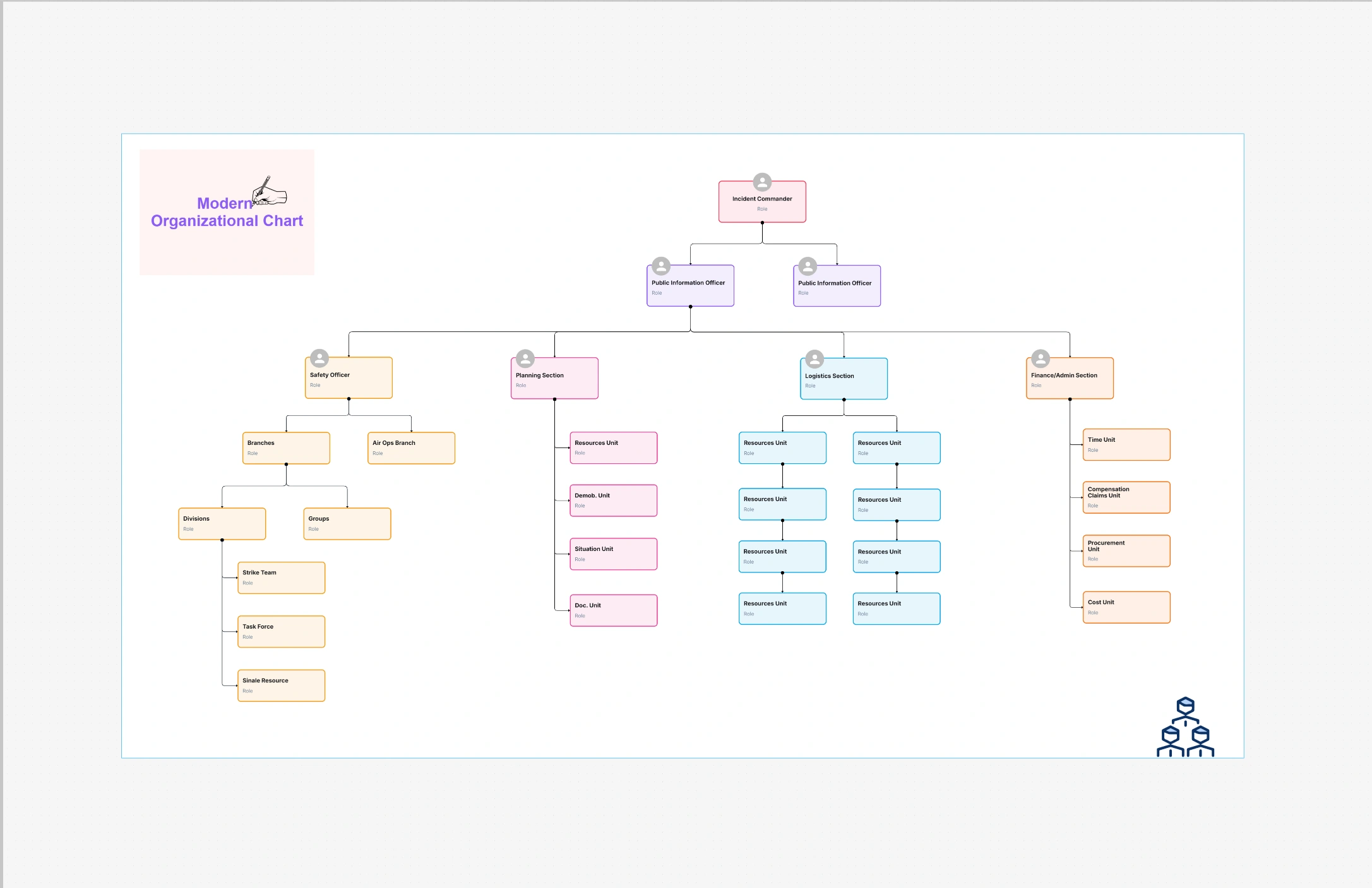
The modern organizational chart template unites modern design with transparency in such a way that the structure is easy to comprehend, matches the brand, and is ready for presentation. This template has switched from heavy boxes and stiff tree layouts to using more white space, cleaner fonts, and more user-friendly spacing. The outcome is a chart that shows the hierarchy and teamwork without distracting the eye with too much detail. No matter if you are showing it to the top management, new employees are being trained, or your structure is online through an intranet, the modern layout will give a fresh professional look.
The template designed for today's hybrid and rapidly changing teams, supports not only traditional hierarchies but also matrix or squad models. The roles, the reporting lines, and the cross-functional relationships are depicted through almost imperceptible visual hints which are very helpful to the viewers in comprehending the actual workflow.When using Cloudairy's Org Chart Maker for editing, changing the layout, color, and node style can be done in just minutes - thus, the chart can be kept accurate as the organization changes.
The template designed for today's hybrid and rapidly changing teams, supports not only traditional hierarchies but also matrix or squad models. The roles, the reporting lines, and the cross-functional relationships are depicted through almost imperceptible visual hints which are very helpful to the viewers in comprehending the actual workflow. When using Cloudairy's Org Chart Maker for editing, changing the layout, color, and node style can be done in just minutes - thus, the chart can be kept accurate as the organization changes.
A modern appearance also represents culture. Through minimalist design, uniform styling, and meticulous color selection, the message of your company being open and unambiguous is out there. This is important for both customer service and recruitment. The future employees and collaborators will get a clear picture of the inter-department relationships, administration routes, and the degree of openness of your organization - such a lot just from one up-to-date diagram.
When your chart needs to be understandable and your brand wants to be represented well in outside or executive environments, then this template is the right one to choose. It is perfect for presentations, company meetings, recruitment web pages, and employee training facilities. This arrangement works particularly well for groups scattered across different offices or in different time zones since the font and spacing make it readable no matter the zoom level. If you’re moving from using fixed spreadsheets or presentation files, the contemporary template will instantly lift the experience without making it harder.
Also, in organizations with mixed structures - corporate back-office functions together with product squads, guilds or chapters - the design gets even brighter. It is possible to see formal reporting lines and at the same time display dotted-line collaboration, thus making the hierarchy of leadership and the reality of delivery both visible and trustworthy.
Step 1: Pick Your Base Layout
It is possible to begin with a top-down approach for traditional leadership perspectives or to select a grid where all departments have the same importance. The matrix configuration allows for dual reporting; depending on your audience, you can show or conceal the secondary lines.
Step 2: Configure Nodes
Step 3: Tune the Look & Feel
Step 4: Share, Embed, or Export
Generate a link that is active and accessible in real-time, put it on your intranet, or get a PDF/PNG copy for presentations to the board. History of versions gives you the option of going back after restructuring.
Organization Chart Templates & Tools
Corporate Organizational Chart Template
How to Customize Organizational Chart Templates
The modern organizational chart template converts your structure into a vivid, brand-consistent narrative. It honors intricacy without mess, demonstrates teamwork without disorder, and adapts smoothly as your personnel shifts. This is the design that is read, comprehended, and relied upon for leadership reviews, recruiting, and day-to-day alignment. Together with Cloudairy's real-time editing, your org chart will become a dynamic source of truth rather than a static artifact.
Loading subcategories...
 Manage all your work in one place
Collaborate with your team
Use Cloudairy for FREE—forever
Explore More