Org Chart
How to Customize Organizational Chart Templates Easily (Step-by-Step)
.webp)

AI Workspace for Diagrams & Collaboration
Get your team started in minutes
Sign up with your work email for seamless collaboration.
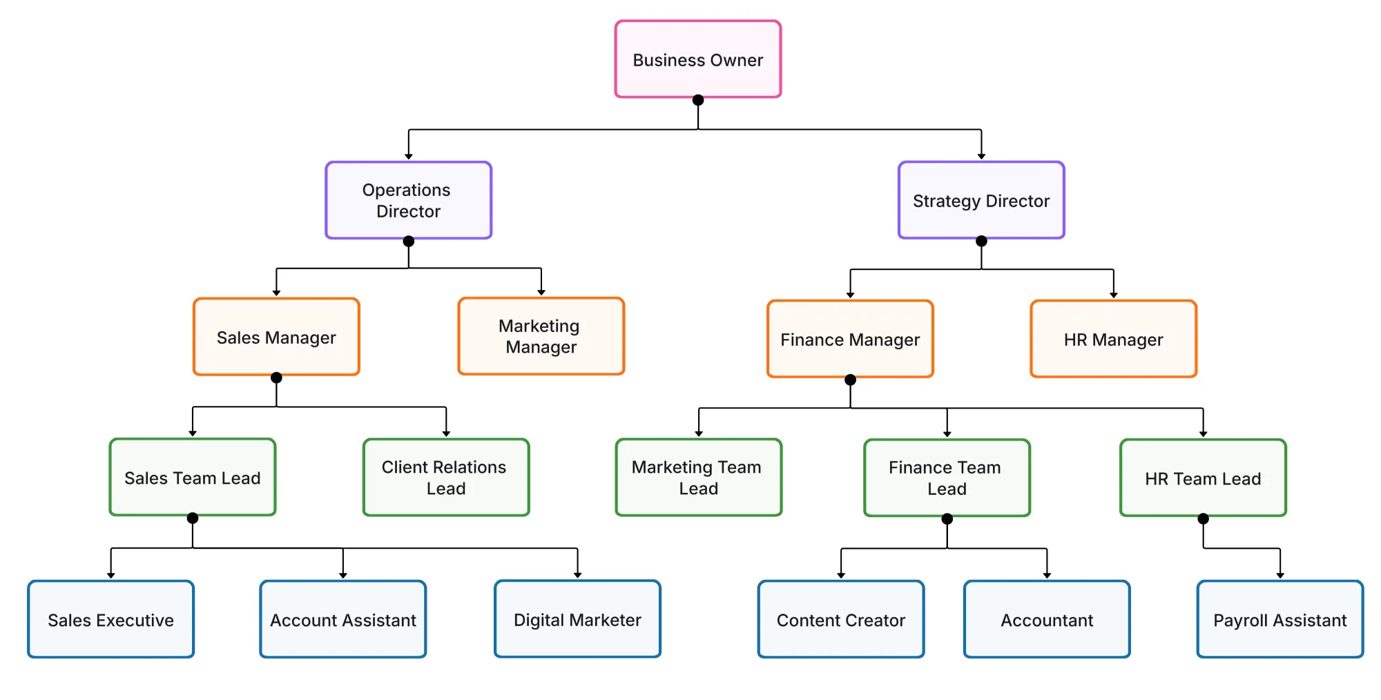
A great organizational chart if not only a diagram but also a pretty good mirror showing the company's way of thinking and collaborating and even its growth. Sadly, the most common practice in most teams is to use simple or even overly complex templates which only end to create confusion among the staff on their respective roles. A personalized organizational chart is the solution here. It synchronizes your visual hierarchy with the culture of your company, increases communication, and facilitates connecting teams from different departments.
Cloudairy's Org Chart Maker allows you to easily create, modify, and customize your chart with no graphic design expertise required. The customization is so vast that the chart not only meets the functional requirements but also matches the visual appearance of the organization, from color coding and grouping of roles to dotted-line collaboration and real-time editing. This guide is taking you step by step on how to plan, structure, style, and share a professional org chart that truly represents your team.
Before you get into design, first figure out the reason behind your chart's creation and the people who will be using it. The chart's purpose will set the limits for its elaboration, the most suitable layout, and the way the information will be illustrated to the target audience. If the onboarding is the target, then a chart that is easy to understand and user-friendly will be required. Conversely, if it is for the visibility of the top management or the board review, then the chart should be sophisticated, comprehensive, and backed by data. You will be able to save time and ensure that your customizations are in line with the actual organizational goals by setting the intent at the start.
Once the purpose is established, all the design decisions from colors to layout will have a particular role to play.
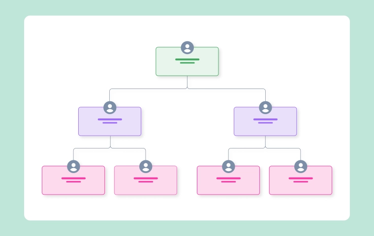
Layout serves as the base of your organogram. Choosing an incorrect one will render your organization confusing, whereas choosing the correct one will immediately enhance its legibility. Your layout should depict your company operations, not merely aesthetic onscreen.
For instance, a hierarchical chart is appropriate for traditional companies having obvious reporting lines, while a flat or pod-based chart is a good fit for startups or agile teams with negligible layers. Cloudairy lets you change layouts with great ease.
The correct layout selection is like the dramatic presentation of a story everything else follows from there.
Design matters a lot, but first things first, accuracy. A beautiful, misleading, and incorrectly illustrated hierarchy chart can easily lead to misunderstanding and even cause management problems. However, using colors and icons can come later; focusing on the accuracy of every title, department, and reporting line is the first step.
Cloudairy allows you to import data directly from spreadsheets or HR systems, thus simplifying the process and ensuring accuracy at the beginning. After your data is organized properly, applying the style is much easier.
Getting the data right will turn your org chart into a reliable reference source instead of just a decorative graphic.
Once your data is set, it’s time to make your chart visually appealing. Good design should make the chart easier to read, not more complex. Your color palette, font, and spacing choices should help people navigate information intuitively.
In Cloudairy, you can apply your brand identity seamlessly select company colors, upload your logo, and choose typefaces that match your corporate design. Consistency across visuals builds credibility and brand recognition, even within internal materials.
Your visual styling should enhance comprehension not overpower it.
Modern teams rarely operate in silos. Many employees work across multiple projects or departments, reporting to more than one leader. A well-customized org chart can reflect this without turning messy.
Cloudairy allows you to add dotted or curved connectors to illustrate these collaborative relationships clearly. When used thoughtfully, these lines make complex structures easier to follow.
This approach ensures that your chart mirrors the dynamic nature of your organization accurately.
Customization doesn’t end with color and layout—you can make your chart more functional with small yet powerful details. Adding badges, icons, or short role summaries gives users quick insights without overwhelming them.
These enhancements transform your chart from static visualization to a living, interactive knowledge map.
Every audience needs a different level of detail. A board member doesn’t need the same view as a team lead, and new hires don’t need to see financial reporting lines. Cloudairy helps you create multiple chart versions effortlessly while keeping them synced.
Customizing multiple views ensures everyone sees the right information—clear, concise, and relevant.
In remote-first workplaces, a live org chart is more than a visual—it’s a digital directory that keeps teams connected. Distributed employees need quick access to understand reporting lines, roles, and time zones.
Cloudairy makes this easy by allowing charts to be shared through live links and embedded in intranets or HR systems. Remote employees can view updates instantly, ensuring everyone operates with the same information.
A well-maintained remote org chart bridges distance and builds cultural unity.
An org chart’s true value lies in how current it is. Stale charts create confusion and reduce trust among teams. The key is to treat your chart as a living system updated whenever roles or teams evolve.
With Cloudairy, maintenance becomes effortless. Changes made by HR or managers automatically sync across shared versions, so there’s never a need to resend attachments or chase updates.
When your chart stays fresh, your company stays aligned.
Once customized, your org chart should be easy to share inside and outside the organization. Cloudairy gives you flexible export options for every situation—reports, presentations, or daily collaboration.
Professional sharing ensures consistency everyone refers to the same, accurate chart every time.
1. How can I make my org chart look professional and consistent?
2. Should I include employee photos?
3. How do I represent dotted-line or project-based reporting?
4. How often should an organizational chart be updated?
5. Can I create multiple versions for different departments?
Start using Cloudairy to design diagrams, documents, and workflows instantly. Harness AI to brainstorm, plan, and build—all in one platform.
Table of Contents

Introduction
 Manage all your work in one placeCollaborate with your teamUse Cloudairy for FREE—forever


 Related Articles

.webp)