Pareto Chart Maker
Pareto Chart Maker — AI-Powered 80/20 Analysis Tool
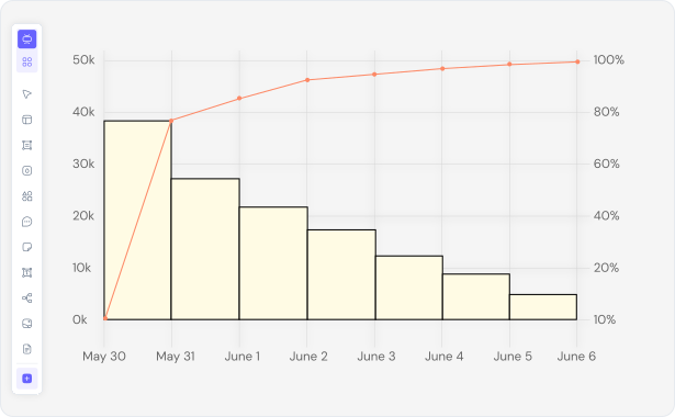
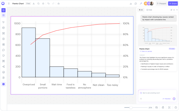
Describe your problem data in plain English and Cloudairy's AI instantly generates a professional Pareto chart with 80/20 analysis, vital few highlighting, and cumulative distribution — in seconds. Export to PNG, SVG, Visio, or PowerPoint. No manual data entry, no spreadsheet required, no signup needed.
AI prompt-to-chart — describe your problem data in plain English and get instant Pareto analysis
80/20 analysis — automatic vital few identification with cumulative distribution visualization
Multi-format export — PNG, SVG, Visio, PowerPoint, and more for all use cases