Weighted Venn Diagram Template

Cloudairy
AI Workspace for Diagrams & Collaboration
Get your team started in minutes
Sign up with your work email for seamless collaboration.
Whiteboard
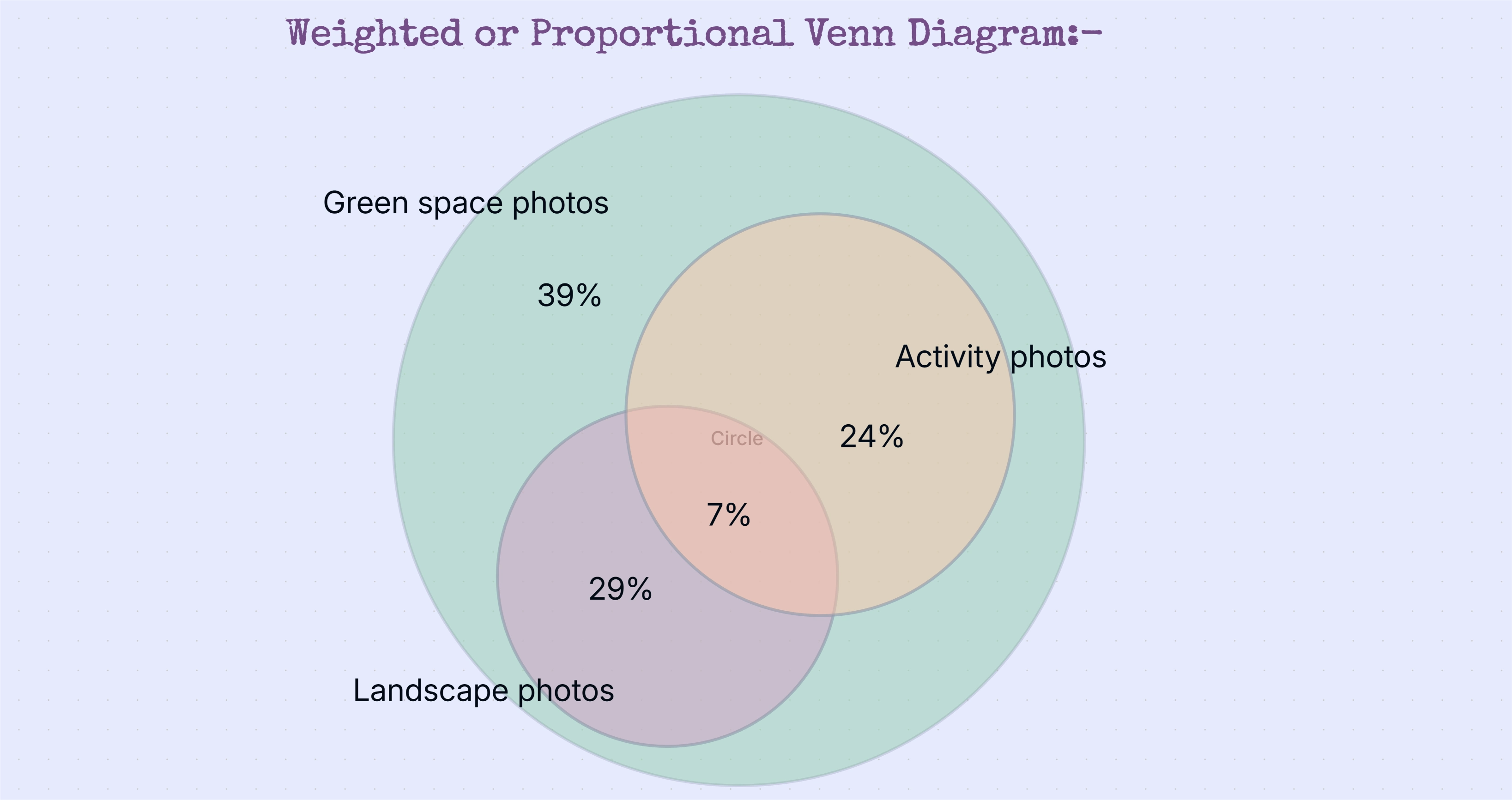
The Weighted Venn Diagram Template helps visualize relationships between data sets while accurately reflecting their relative sizes. By scaling each section proportionally, it makes overlaps, category dominance, and data significance easy to understand.
The Weighted Venn Diagram Template helps visualize relationships between data sets while accurately reflecting their relative sizes. By scaling each section proportionally, it makes overlaps, category dominance, and data significance easy to understand.
The Weighted Venn Diagram Template is designed to display relationships between multiple data sets while accurately representing their relative sizes. By scaling each section proportionally, this template helps users visualize not only where overlaps exist, but also how significant each category is within the overall context.
You can also explore our AI Venn Diagram Template to compare ideas, concepts, and data visually with ease.
Loading subcategories...
 Manage all your work in one place
Collaborate with your team
Use Cloudairy for FREE—forever
Explore More