AI Radar Chart Maker
AI Radar Chart Maker — Free Spider Chart & Radar Diagram Tool Online
Describe your data and variables in natural language and Cloudairy's AI instantly generates a publication-ready radar chart or spider diagram — in seconds. Choose from basic, filled, overlapping, comparative, and 3D spider layouts. Export to PNG, SVG, or PDF. No signup required.
AI prompt-to-radar chart — describe your variables in plain English and get a chart in seconds
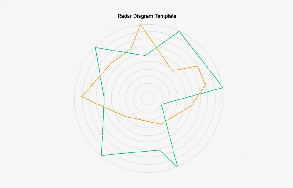
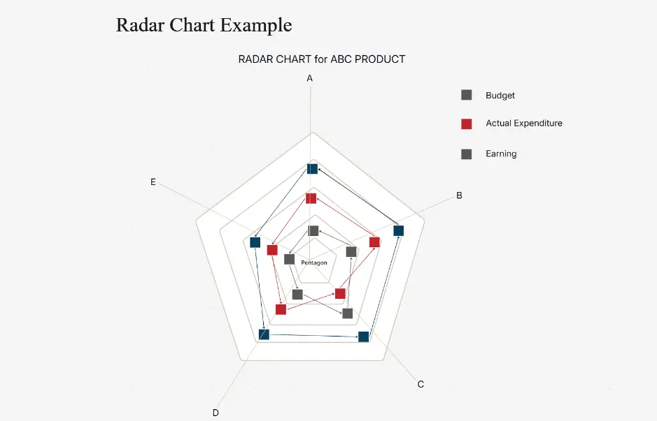
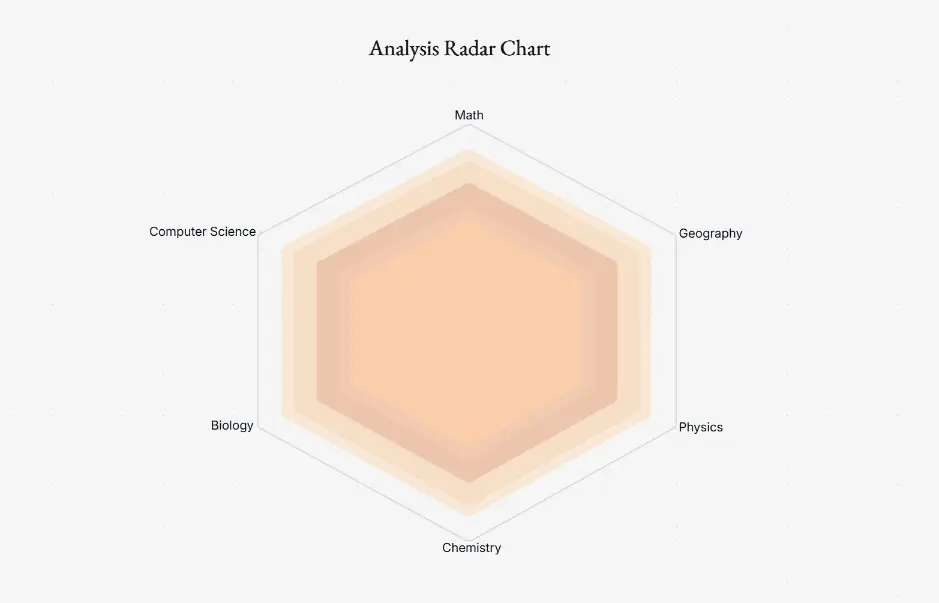
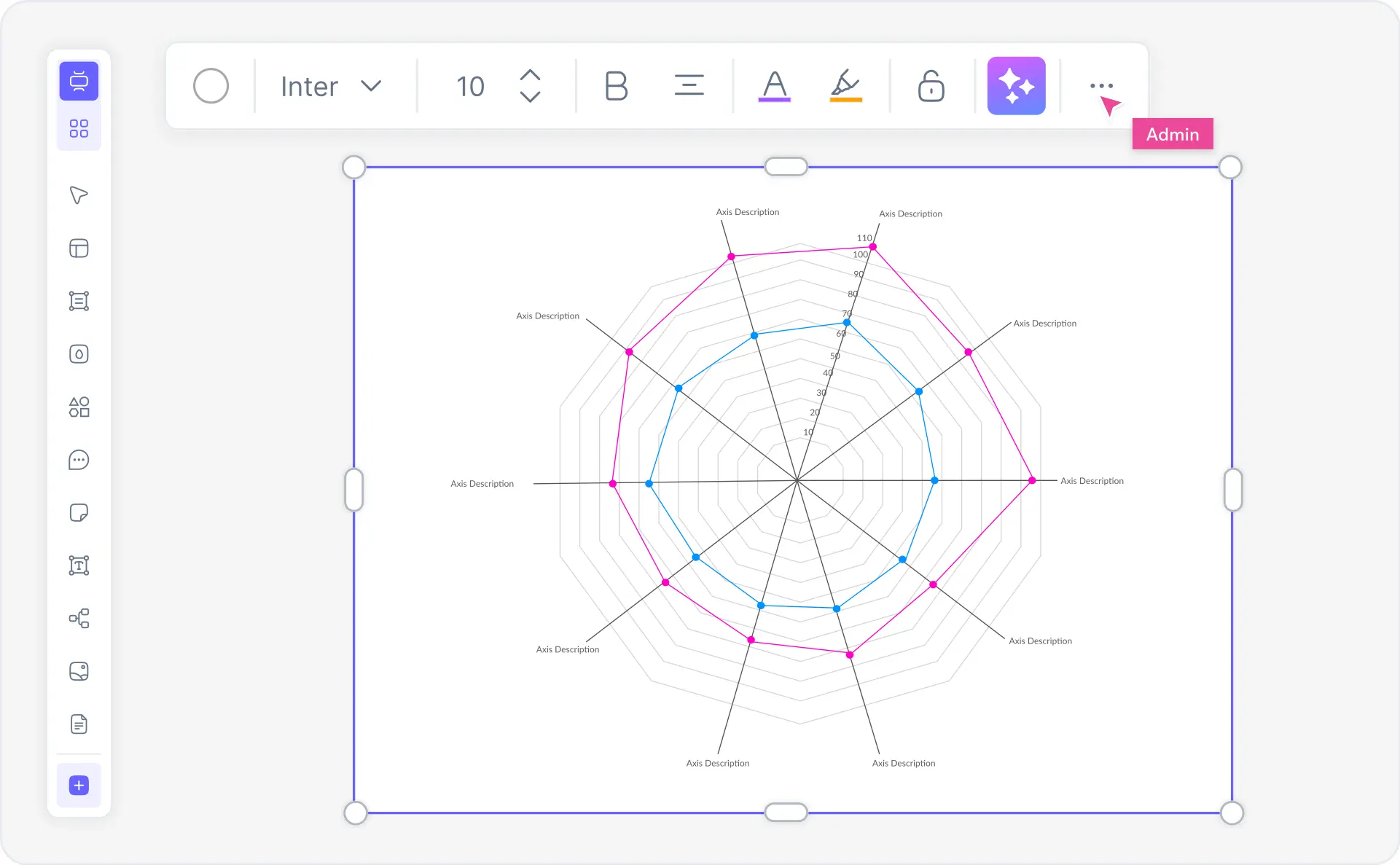
5+ radar chart types — basic, filled, overlapping, comparative, and 3D spider chart layouts
Export PNG, SVG, PDF — or embed as an interactive link in reports and presentations