Tape Diagram Example

Cloudairy
AI Workspace for Diagrams & Collaboration
Get your team started in minutes
Sign up with your work email for seamless collaboration.
Whiteboard
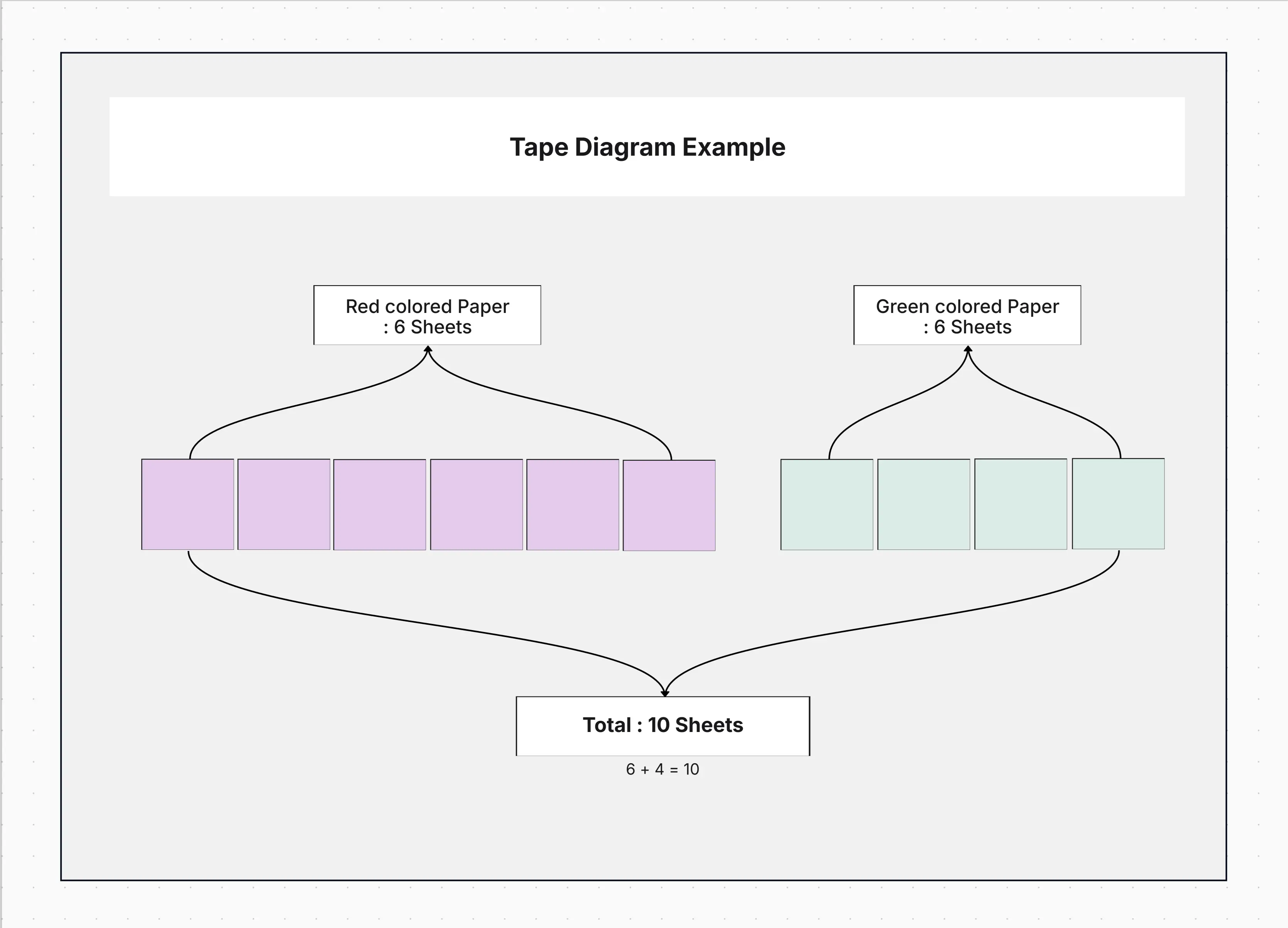
Represent ratios, fractions, and part-whole relationships visually with the Tape Diagram Example. Ideal for math modeling, finance analysis, and resource planning to simplify complex comparisons.
Represent ratios, fractions, and part-whole relationships visually with the Tape Diagram Example. Ideal for math modeling, finance analysis, and resource planning to simplify complex comparisons.
The Tape Diagram Example brings to light the proportional relationships, ratios, and part-whole comparisons in a very vivid and simple manner. The method is very popular in education, finance, and project planning where it is used to depict data parts that make up a total.
The tape diagrams make it easy to understand the numbers and their meanings whether you are teaching math, distributing resources, or creating a budget.
This pre-built template gives you all the flexibility needed to represent comparisons, ratios, and proportions effectively.
The diagram can help to illustrate proportions, visualize comparisons in terms of fractions, and so on. It’s perfect for educators explaining mathematical ratios, financial analysts visualizing budgets, and project managers planning resource allocations.
The use of tape diagrams allows viewers to grasp instantly the connection between parts and the whole without resorting to sophisticated graphs or working out calculations.
Build structured and scalable architectures with Cloudairy design templates.
Adapt the Tape Diagram Example to suit your visualization goals and presentation style.
This visual model is versatile and applicable across multiple fields where understanding proportions and relationships is key.
Visualize ratios, fractions, and proportional relationships effortlessly with the Workflow & Process Diagram Maker. Create intuitive, presentation-ready tape diagrams for education, finance, and project planning in minutes.
Explore related resources:
1 What is the main purpose of a tape diagram?
A tape diagram provides a visual representation of the relationships among quantities by partitioning a total into corresponding segments. This method makes it easier to compare these quantities and to express ratios or fractions without difficulties.
2 How is a tape diagram different from a bar diagram?
Both types of diagrams utilize rectangular shapes but differ in the case that a bar diagram compares different independent categories while a tape diagram illustrates parts of a single total or ratio relationship between connected quantities.
3 Can I use tape diagrams outside of education?
Indeed. Tape diagrams are becoming more and more common in the areas of finance, business planning, and operations along with other ways of representing proportional data such as cost allocation and time distribution in a visual manner.
4 Can I display percentages or numeric values in each block?
Absolutely. The segments in question are capable of supporting labels for values, percentages, or text descriptors, therefore making the visualization both didactic and analytically powerful.
5 Does this template support grouped or layered tapes?
Yes. It is possible to replicate and stack tape layers in order to have several ways or cases of analyzing data put next to one another from the perspective of greater clarity to work.
Loading subcategories...
 Manage all your work in one place
Collaborate with your team
Use Cloudairy for FREE—forever
Explore More